
Alright, folks, let’s get one thing straight: despite what your grandma might say, everyone judges a book by its cover. Seriously, if you’ve ever bought a book solely because the cover had a cool dragon or a mysterious, brooding guy (we see you, romance readers), then this article is for you.
Imagine you’re speed-dating books in a bookstore. You’ve got mere seconds to make a connection before you swipe left and move on to the next one. The cover is that crucial first impression. If it’s love at first sight, you’ll pick it up, flip it over, and maybe, just maybe, give it your number (or take it to the checkout).
Let’s talk psychology for a second. Your brain, that wonderful decision-making jelly, processes images way faster than text. So, a cover that pops can trigger interest faster than you can say “New York Times Bestseller.” Colors, images, and fonts work together like a well-choreographed dance to make you feel something—excitement, curiosity, or even a little bit of fear (i see you, horror books!).
Now, what makes a cover so irresistible that you just have to buy the book? Here are the top contenders for Best Cover Elements:
– Title and Author’s Name: Clear, bold, and no fancy fonts that require a magnifying glass. If you can’t read it at a glance, it’s a no-go.
– Imagery: High-quality images or illustrations that hint at the book’s content without being a spoiler. Think of it as the book’s Tinder profile picture.
– Color Scheme: Colors that evoke the right emotions. Red for fiery romance, blue for a chill mystery, and black for that “I’m probably going to be up all night with the lights on” horror story.
– Typography: Fonts that scream the book’s personality. Serif fonts for the classics, sans-serif for the modern chic, and maybe a touch of comic sans for that quirky humor (just kidding, never use comic sans).
– Layout: Balanced and not too cluttered. Remember, less is more unless you’re making a point about chaos theory.
Every genre has its own set of unwritten rules about covers. If you’re a romance fan, you know the deal—swooning couples, heartwarming scenes, and lots of pinks and reds. Thrillers? Dark, moody colors with a hint of danger. Fantasy and sci-fi? Expect dragons, spaceships, or maybe a dragon on a spaceship.
It’s like knowing the dress code for a party. You wouldn’t show up to a black-tie event in your pajamas (unless it’s that kind of party).
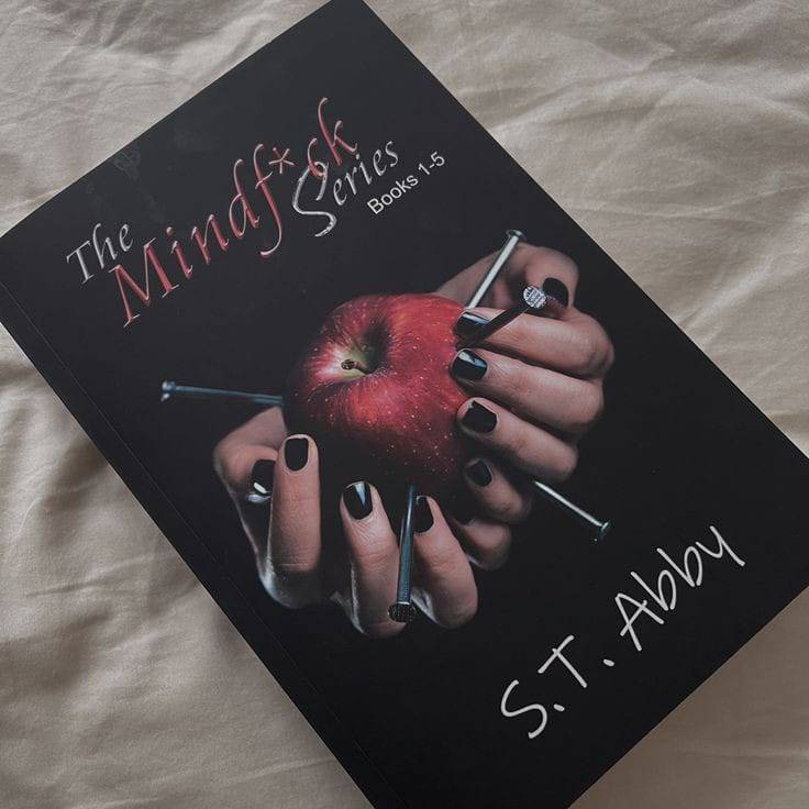
Sometimes, book covers are like clever little puzzles that only make sense after you’ve read the book. Take “Mindf*ck” by S.T. Abby for example. The cover features a singular apple with nails digging into it. At first glance, it might seem like a weird choice for a thriller. But once you dive into the story, you realize the cover is a brilliant reflection of the plot. The apple represents innocence and temptation, while the nails symbolize the underlying pain and darkness. It’s a clever nod to the story that readers can appreciate only after they’ve devoured the book.
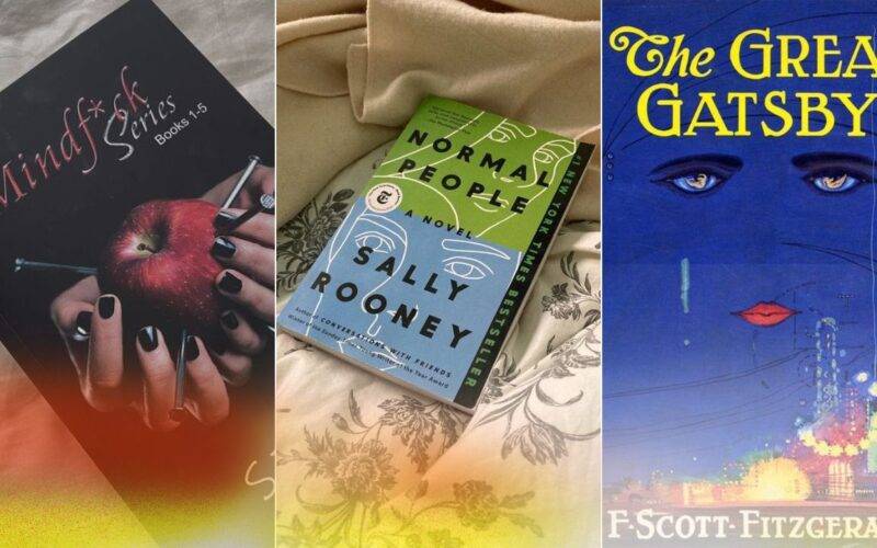
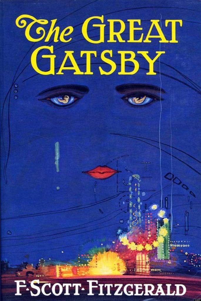
- “The Great Gatsby” by F. Scott Fitzgerald: Ah, the classic. That original cover with the haunting eyes and dazzling lights of the 1920s jazz era. It’s like the Mona Lisa of book covers—iconic and impossible to forget.
- “Twilight” by Stephenie Meyer: Remember when vampires were all the rage? That simple image of hands holding an apple screamed “forbidden fruit” and made teenage hearts everywhere skip a beat. Plus, it was practically made for Instagram before Instagram was even a thing.
- “The Subtle Art of Not Giving a F*ck” by Mark Manson: Bright orange cover, bold black text. It’s loud, it’s in-your-face, and it’s perfect for a book that’s all about breaking the rules. You could spot this baby from a mile away, and that’s exactly the point.
- “Mindf*ck” by S.T. Abby: Let’s revisit this gem. The apple with nails isn’t just a random choice; it’s a symbolic representation of the book’s themes. The cover draws you in with its intriguing imagery, and once you understand its significance, it enhances your reading experience.
In the age of Amazon and eBooks, covers face a new challenge: looking good as a thumbnail. If a cover can’t grab your attention when it’s the size of a postage stamp, it’s game over. Digital marketing relies heavily on these tiny previews, so designers have to ensure their covers stand out even when they’re shrunken down.
Imagine you’re scrolling through a sea of book covers on your phone. A good cover needs to be like a lighthouse in a storm—bright, noticeable, and guiding you to safety (or in this case, to an amazing book). Designers have to balance intricate details with bold elements to make sure the cover is effective at any size.
Now, let’s think about something tricky: what if the cover doesn’t exactly match the book’s theme but still needs to be in sync with the story? It’s like pairing a gourmet meal with the perfect wine—sometimes, you have to think outside the box (or bottle).
Even if a cover doesn’t scream the exact plot or genre, it should still resonate with the book’s overall vibe. For instance, a book might have a whimsical cover with playful fonts and bright colors, yet the story inside is a deeply philosophical exploration. The trick here is to create a cover that hints at the book’s complexity in a subtle way, maybe through the use of abstract art or symbolic imagery.
A great example is “The Catcher in the Rye” by J.D. Salinger. The cover often features a carousel horse, which on the surface seems whimsical and light. However, once you dive into Holden Caulfield’s narrative, you realize the cover’s deeper significance and its connection to themes of innocence and nostalgia.
Once upon a time, book covers were as plain as unbuttered toast. Just a title and an author’s name on a drab background. Then came the printing revolution, and covers got a glow-up. Suddenly, they were colorful, intricate, and as varied as the books themselves. Today, we’ve come full circle with some minimalist trends, but trust us, they’re anything but boring.
Think about the 1960s and 70s when psychedelic art made book covers a trippy, colorful feast for the eyes. Fast forward to the 80s and 90s, and you had bold, neon designs and flashy, sometimes downright cheesy imagery (we’re looking at you, romance novels with Fabio on the cover). Nowadays, there’s a move towards sleek, minimalist designs that still pack a punch.
Let’s wrap this up with a big, shiny bow. Book covers are like the bouncers of the literary world. They decide who gets in and who stays out, making them crucial for sales and audience attraction. A killer cover not only grabs attention but also conveys the essence of the book, sets expectations, and helps it stand out in the crowded market.
So next time you find yourself judging a book by its cover, don’t feel bad. Embrace it. After all, those covers are working hard to win you over, one glance at a time. Whether it’s the haunting eyes of Gatsby, the forbidden fruit of “Twilight,” the bold declaration of Manson’s manifesto, or the symbolic apple of “Mindf*ck,” these covers are the silent sellers, the visual bait, and the unsung heroes of your reading journey.
Now go forth and pick your next read based on that glorious cover—because first impressions really do count! And remember, behind every great book cover, there’s a team of designers, artists, and marketers who know exactly how to catch your eye and steal your heart.